How to Create a Luxury Interior Design Mood Board: A Step-by-Step Guide
A beautifully designed home rarely comes together by choosing individual pieces at random. Even when every piece of furniture, fabric, and finish is attractive on its own, the final room may feel disconnected if the elements do not work together.
A luxury interior design mood board helps solve this problem. It brings colors, materials, furniture styles, lighting ideas, and decorative details into one visual plan before major purchasing decisions are made.
A mood board is not just a collection of inspirational photographs. It is a practical design tool that helps you establish a consistent direction, compare options, and create rooms that feel intentional rather than overdecorated.
In this guide, you will learn how to create a luxury interior design mood board, which elements to include, how to coordinate materials, and which common mistakes to avoid.
What Is an Interior Design Mood Board?
An interior design mood board is a visual collection of references that communicates the look and atmosphere you want to create in a space.
It may include paint colors, fabric samples, flooring finishes, furniture references, lighting fixtures, artwork, and photographs of interiors that inspire you.
For a luxury home, the goal is not to include the most expensive-looking items. It is to create a thoughtful relationship between materials, proportions, colors, textures, and light.
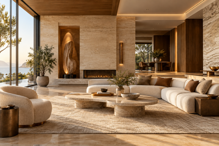
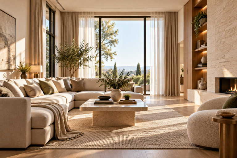
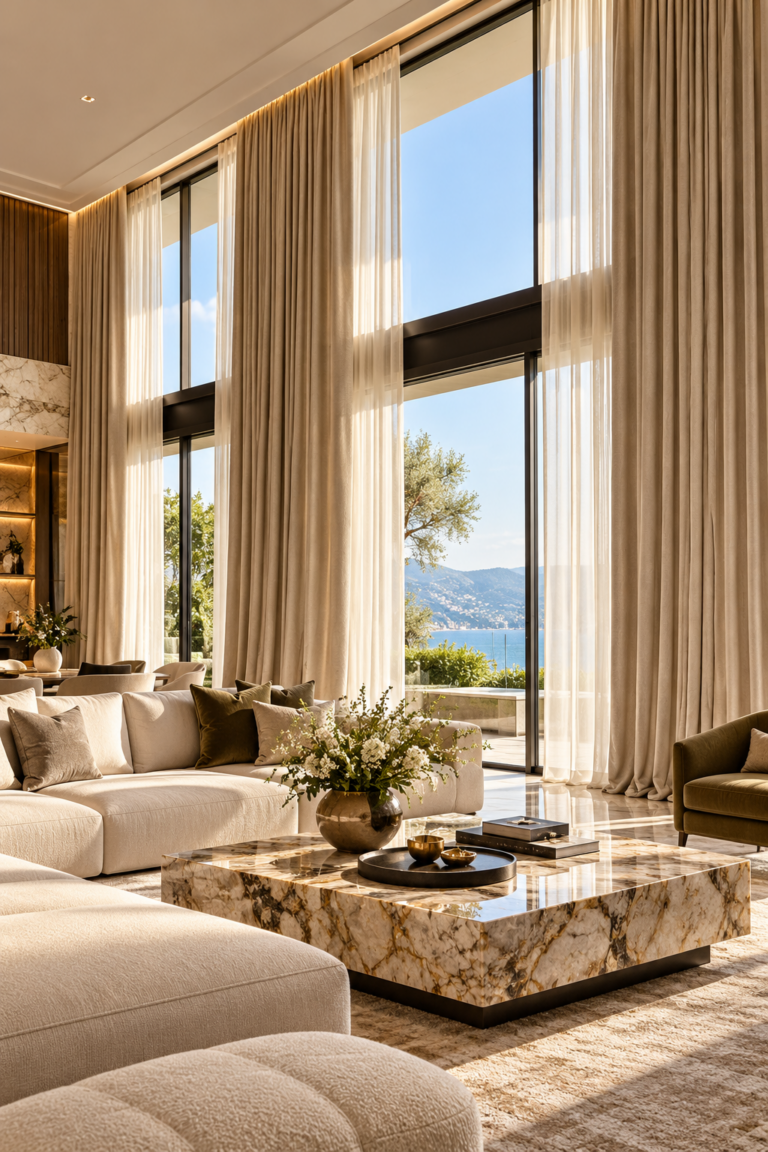
For example, a calm contemporary living room might combine warm ivory walls, natural oak, textured linen, a honed limestone surface, and subtle bronze details. The mood board helps you see whether these elements complement one another before they become permanent design choices.
Step 1: Define the Feeling You Want to Create
Begin with the atmosphere of the room rather than a shopping list.
Ask yourself how the finished space should feel. Should it be calm and understated, dramatic and architectural, warm and inviting, or bright and contemporary?
Choose three to five descriptive words to guide your decisions. For example:
- Warm, natural, and understated
- Refined, sculptural, and contemporary
- Airy, soft, and timeless
- Dramatic, intimate, and sophisticated
These words become a filter for every later choice. If a furniture piece looks attractive but does not support the intended atmosphere, it may not belong in the final design.
Also consider the room’s purpose, the amount of natural light it receives, and how the household will use it every day.
Step 2: Choose a Cohesive Color Palette
Color creates the foundation of a room’s visual identity. Rather than selecting several unrelated shades, build a palette with a clear relationship between its colors.
A useful starting point is to choose:
- One dominant color for the largest surfaces
- One or two supporting colors for furniture and textiles
- One accent color for selected details
- One or two material-based neutrals to add depth
For example, a sophisticated natural palette could include warm white, sand, muted taupe, walnut brown, and a restrained touch of dark bronze.
A more dramatic palette might combine deep olive, warm charcoal, creamy stone, and aged brass.
These are starting points rather than fixed formulas. The right balance depends on room size, daylight, existing finishes, and personal preference.
Practical tip: View paint and fabric samples in the actual room at different times of day. A shade that looks balanced in a bright showroom can appear much cooler or darker under different lighting.
Step 3: Select Materials Before Finalizing Decorative Details
Luxury interiors often feel convincing because their materials have depth and character. A mood board should therefore show how the main finishes work together, not just which colors look attractive.
Consider including samples or references for:
- Flooring and wall finishes
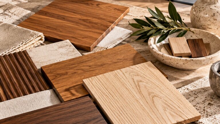
- Wood tones and grain patterns
- Stone or stone-look surfaces
- Upholstery and curtain fabrics
- Metal finishes
- Glass, ceramic, or other decorative materials
Pay attention to both color and texture. Smooth stone beside textured linen, for instance, can create a more interesting composition than several similarly smooth surfaces.
You should also consider maintenance. Natural stone, delicate fabrics, and certain wood finishes may require more care than alternatives. A beautiful material is only a successful choice if it suits the way the room will be used.
When comparing finishes, place samples beside one another under similar lighting. This makes undertones and texture differences easier to recognize.
Step 4: Add Furniture With the Right Proportions
Once the palette and primary materials are established, introduce the main furniture pieces.
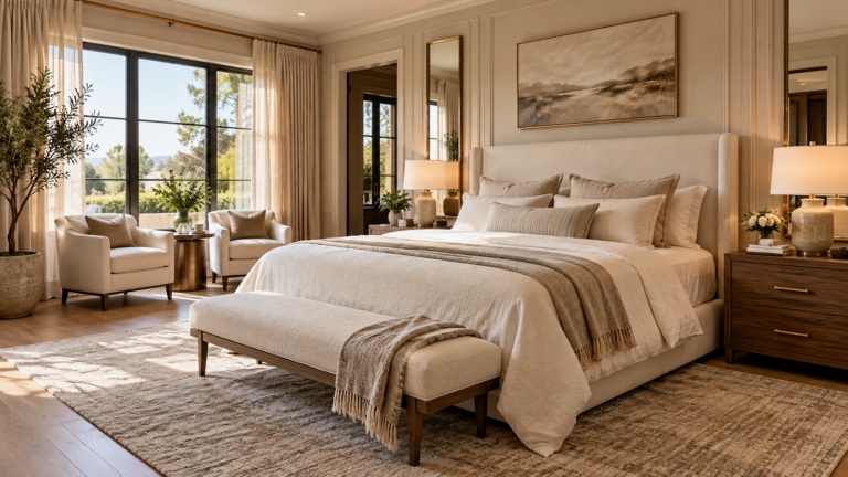
Choose references that reflect the room’s intended scale and style. A sculptural sofa, a well-proportioned dining table, or a simple upholstered bed can establish the visual direction without requiring numerous decorative objects.
Avoid selecting furniture based on appearance alone. Consider the dimensions of the room, circulation paths, seating requirements, and the relationship between each piece.
For example, a large sofa may look impressive in a product photograph but overwhelm a compact living room. A mood board can reveal the intended style, but it should be supported by a measured floor plan before furniture is purchased.
Include only the most important furniture references at this stage. Too many competing silhouettes can make the board difficult to interpret.
Step 5: Layer Lighting Into the Design
Lighting should be part of the mood board from the beginning, not an afterthought.
A well-considered lighting plan often combines three functions:
Ambient lighting provides general illumination throughout the room.
Task lighting supports activities such as reading, cooking, working, or dressing.
Accent lighting draws attention to architectural features, artwork, textured surfaces, or selected objects.
Add references for the main fixtures and note the intended lighting effect. A sculptural pendant may establish a focal point, while discreet wall lights or table lamps can create a softer atmosphere.
Think about the color temperature of the light and how it interacts with the proposed finishes. Warm lighting can make some materials appear richer, while cooler lighting may change how certain neutrals are perceived.
For detailed planning, confirm fixture placement, electrical requirements, and appropriate illumination levels before installation.
Step 6: Include Textiles and Tactile Details
Textiles help connect the hard finishes and furniture into a comfortable, layered interior.
Depending on the room, your mood board might include curtain fabric, upholstery, cushions, bedding, or a reference for a textured wall covering.
Aim for variety without visual clutter. A combination of smooth cotton, softly textured linen, and a restrained woven accent can add depth while preserving a calm palette.
Patterns should also have a clear purpose. If the room already contains strong architectural lines or expressive stone veining, quieter textiles may provide better balance. In a simpler room, a carefully chosen pattern can introduce character.
Whenever possible, compare real fabric samples. Screen images cannot reliably communicate softness, thickness, drape, or the way a material changes under light.
Step 7: Bring the References Together
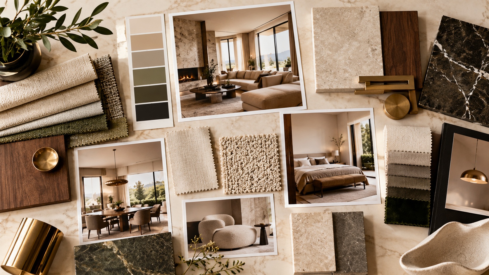
You can create a physical mood board using printed photographs and material samples, or a digital board using a design application or presentation tool.
Arrange the elements so that the most important decisions are easy to understand.
A useful layout places the dominant color and primary materials near the center, with furniture references, lighting, textiles, and smaller accents around them.
Include a small number of strong references rather than every image you have saved. The board should communicate a clear direction in a few seconds.
You may also label important samples with their intended use, such as “main wall finish,” “secondary wood tone,” or “accent metal.” These notes help turn inspiration into an actionable plan.
Keep inspiration images separate from confirmed product selections. A photograph can communicate an atmosphere without representing a product that is available, affordable, or suitable for your room.
Step 8: Test the Board Against the Real Room
Before finalizing the design, compare the mood board with the room’s actual conditions.
Check the following:
- Does the palette work with existing floors, windows, and architectural details?
- Will the selected furniture fit without obstructing movement?
- Do the wood and stone tones complement each other?
- Is there enough contrast to prevent the room from looking flat?
- Are the materials appropriate for the room’s daily use?
- Does the lighting support both practical tasks and the desired atmosphere?
If possible, obtain physical samples of the most important finishes and place them together in the room.
Review the combination in morning, afternoon, and evening light. Make changes before ordering expensive materials or committing to custom furniture.
Common Mood Board Mistakes to Avoid
Choosing too many styles
Combining multiple unrelated design directions can make a room feel inconsistent. You can mix styles successfully, but the combination needs a connecting element, such as a shared palette, material, or visual rhythm.
Selecting every finish separately
A beautiful individual sample does not guarantee that the complete combination will work. Evaluate materials together rather than approving each one in isolation.
Ignoring scale
Mood boards communicate appearance, not physical dimensions. Always check furniture measurements and room layouts before making purchases.
Copying an inspiration photograph too literally
A reference image can offer useful ideas, but its proportions, daylight, architecture, and furnishings may differ from your own space. Adapt the principles rather than attempting to reproduce every detail.
Overloading the board
Too many images and samples make it harder to identify the main design direction. Remove anything that does not support the room’s intended atmosphere.
Forgetting practical needs
Maintenance, comfort, durability, storage, and budget matter as much as appearance. A successful luxury interior should work well in everyday life.
A Simple Luxury Mood Board Checklist
Before moving from inspiration to purchasing, confirm that your board includes:
- A clearly defined design direction
- A coordinated color palette
- References for the primary finishes
- The main furniture pieces
- Ambient, task, and accent lighting considerations
- Appropriate textiles and decorative details
- Measurements and a separate room layout
- Notes on maintenance, availability, and budget
You do not need to finalize every decorative object at once. Start with the decisions that are expensive or difficult to change, such as flooring, fixed finishes, and major furniture. Smaller accessories can be selected once the foundation is established.
Final Thoughts
A luxury interior design mood board is most useful when it turns inspiration into clear, connected decisions. By defining the atmosphere first, coordinating colors and materials, considering furniture proportions, and testing samples in the actual room, you can reduce guesswork and create a more cohesive result.
The goal is not to fill a board with expensive products. It is to understand how each element contributes to the overall space—and to make sure the finished room feels considered, comfortable, and personal.
At Casa Élite, thoughtful design begins with the relationship between materials, light, proportion, and everyday living. A well-prepared mood board is a practical first step toward bringing those elements together.
Frequently Asked Questions
What should an interior design mood board include?
It should include a color palette, primary material references, furniture ideas, lighting, textiles, and selected inspiration images. A room plan and measurements should be prepared separately to check practical fit.
How many images should a mood board have?
There is no fixed number. Use enough references to communicate the direction clearly, but remove images that introduce conflicting styles or do not support the design.
Can I create a luxury interior mood board on a budget?
Yes. A mood board is a planning tool, not a purchasing commitment. You can explore affordable materials, compare alternatives, and prioritize spending on elements that have the greatest impact on the room.
Should I choose paint or furniture first?
Begin by defining the overall atmosphere and considering the room’s permanent features. Then coordinate the main materials and large furniture pieces before finalizing paint shades and smaller decorative details. Test samples together whenever possible.
Is a mood board the same as an interior design plan?
No. A mood board communicates the visual direction, while a design plan addresses practical details such as dimensions, layout, circulation, specifications, and installation requirements. Both can be used together for better results.
Explore More Luxury Interior Design Ideas
Choosing the right materials is an important part of creating a cohesive interior. Explore our guide to marble, travertine, and porcelain to understand how different surfaces can influence your home’s design.
Lighting also shapes the mood and appearance of a room. Read our guide on how to choose lighting for a luxury home for practical ideas on layering light throughout your space.
For more inspiration on balancing furniture, finishes, and decoration, discover how to make a living room look expensive without overdecorating.